Web Typography
A brief guide to type on the web
Created by Ben Attenborough / @WebDesignerBen
Technical considerations
Native fonts Vs Self hosted fonts Vs Remote hosted fonts
Native fonts
Native fonts live on the user’s system. Since they are already on the user’s computer they will display instantly. Be careful though, as fonts available on one system may not be available on another. For example the font “Helvetica” is available on OSX (Macs), but not Windows (PCs)
Native fonts
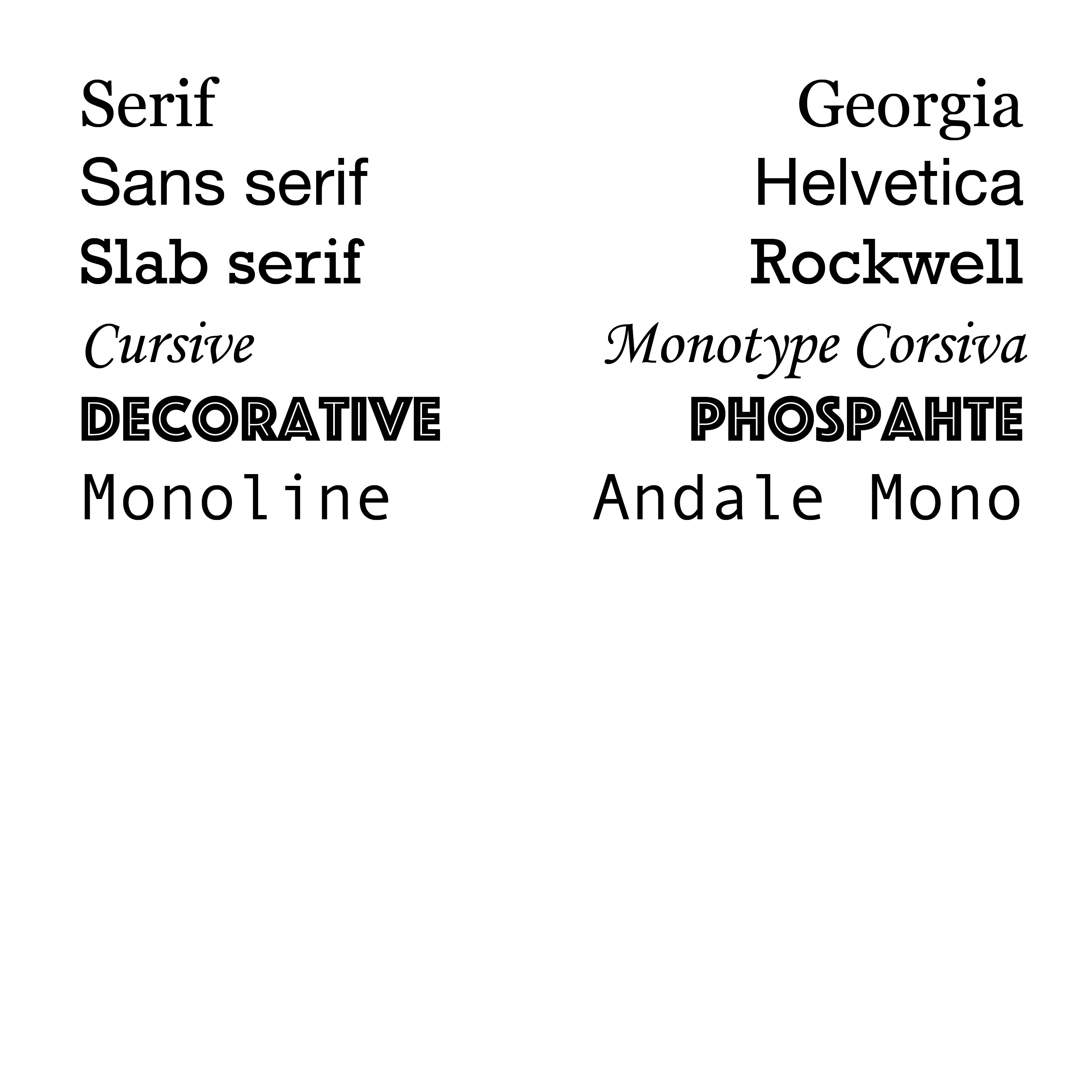
Systems default to one of five generic categories
- serif
- sans-serif
- monospace
- cursive
- fantasy
You can check which fonts are available on each operating system at: http://www.cssfontstack.com/
Font stacking
Because all systems have default fonts for all these categories we should specify them as backup fonts in our “font stack”.
A font stack specifies a list of fonts to use with each subesquent font being a fall back if the previous font was not found
Font stacking
For example:
font-family: 'Helvetica Neue', Helvetica, Arial, sans-serif;
Is an example of a font stack for Helvetica Neue. This typeface in available on modern Macs but may not be available for older ones. If the typeface isn't found we default to Helvetica, then Arial (the Windows equvilent) and finally sans-serif. Check http://www.cssfontstack.com/ for example font stacks.
Font stacking
This is important because when we use our own fonts we still need a font-stack so that the user still gets a useable typeface if ours fails to be delivered for whatever reason.
Self hosted fonts
These are fonts that we install on our server and the user’s browser downloads when they visit the page.
We generally call them using the @font-face code in our css
Self hosted fonts
Fonts come in a variety of formats:
- woff2 - Cutting-edge Web Open Font Format
- woff - Web Open Font Format
- ttf - True Type Font
- eot - Embedded OpenType, used on Windows
- svg - Scalable Vector Graphic
We mostly want to use woff2 and woff, but may need to provide ttf, eot and svg as fallbacks for very old browsers
Examples of use
@font-face {
font-family: 'MyWebFont';
src: url('myfont.woff2') format('woff2'),
url('myfont.woff') format('woff');
}
Examples of use
body {
font-family: 'MyWebFont', Fallback, sans-serif;
}
Self hosted fonts - Pros and Cons
Self hosted gives you more control over the fonts you use
More reliable delivery, since you are relying on your server and not someone elses
Get to chose from all the web fonts available in the world
Expensive
Calls for a commitment
Fiddly to setup and get working - requires downloading files, uploading them to your server
Remotely hosted fonts
An alternative to buying fonts and installing them on your system is to use a remote service. Options include:
- Google Fonts
- Adobe Typekit
Remotely hosted fonts
Instead of calling the font files from your own server these are called from a seperate service.
Examples of use
Add to head of your document
<link href='https://fonts.googleapis.com/css?family=Open+Sans' rel='stylesheet' type='text/css'>
And call it in your CSS thus:
font-family: 'Open Sans', sans-serif;
Remotely hosted fonts - Pros and Cons
Less control over the fonts
Relying on another server - font stack even more important
More limited choices
Can be free. Subscription services cost money - but gives you the chance to play with fonts more
...therefore no commitment
Quick to set up
Anatomy of type
Baseline
Cap-height
X-height
Types of font
Context
Type for the moment
Type for long-form reading
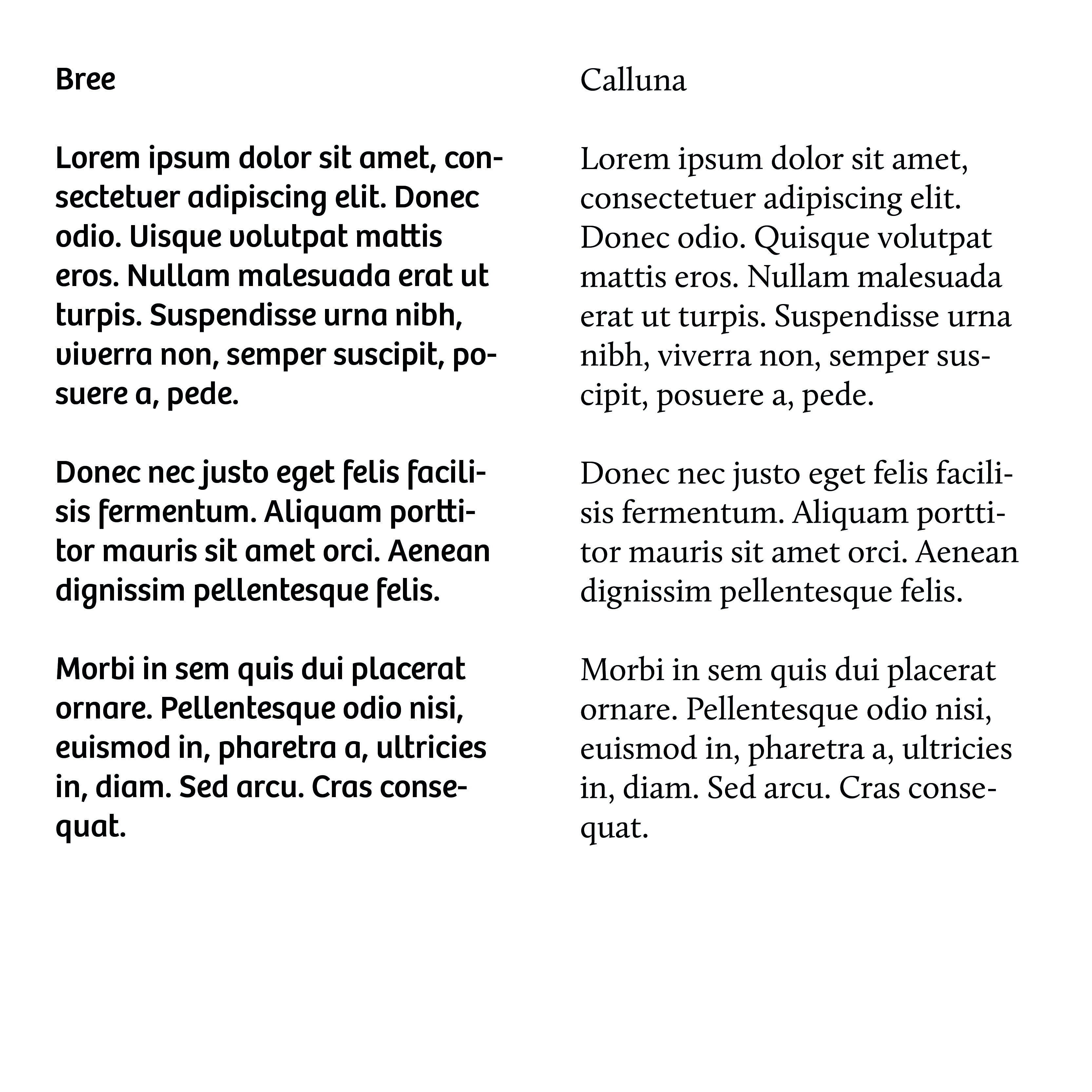
Longform type
Eccentrities amplified when repeated e.g. Bree Vs Calluna
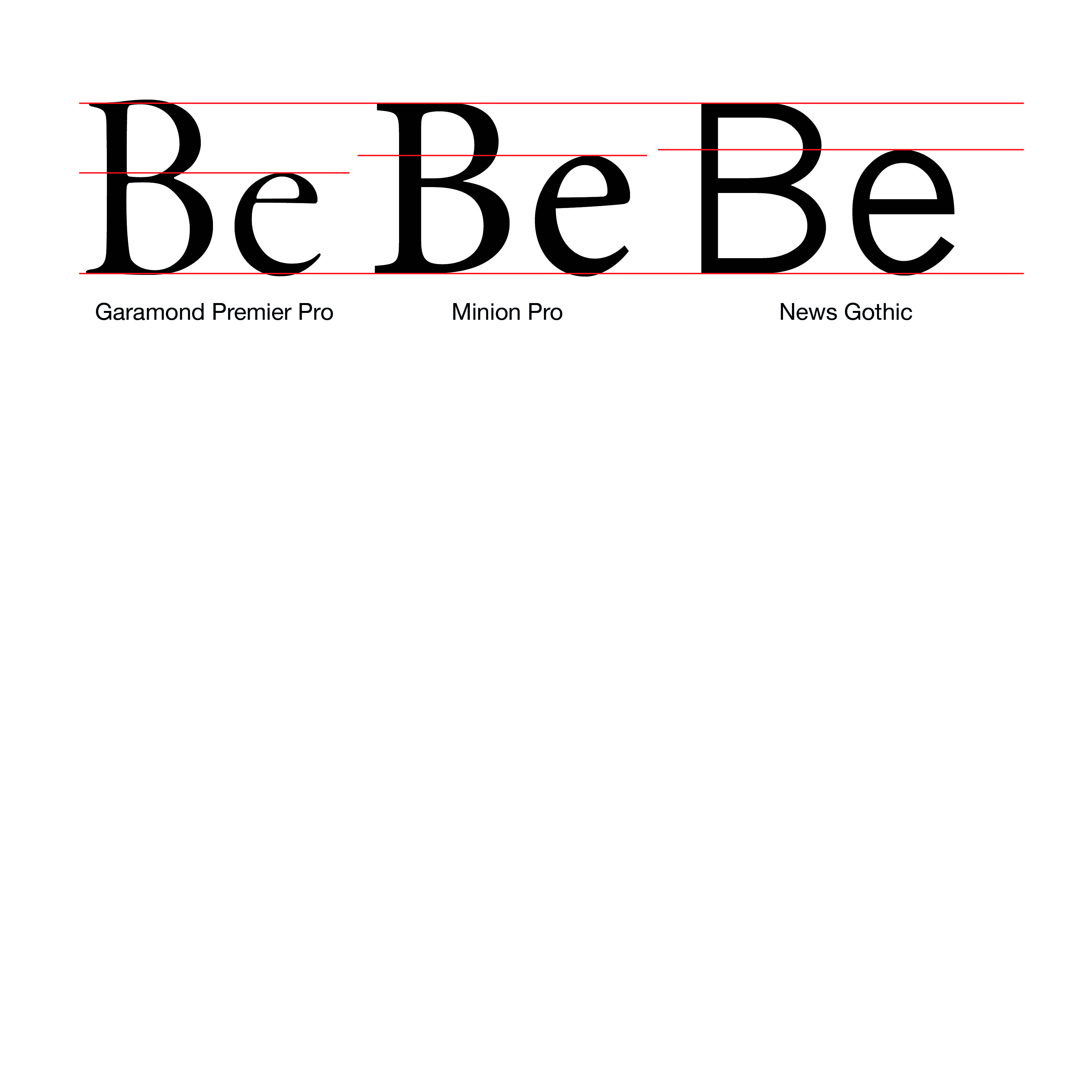
Good x-height: 60-70% of cap height
Low to medium contrast
Distinct letterforms
Full punctuation / extended language as required
Eccentricity examples
X-height examples
Low to medium contrast


Pairing fonts
Contrast Vs Harmony
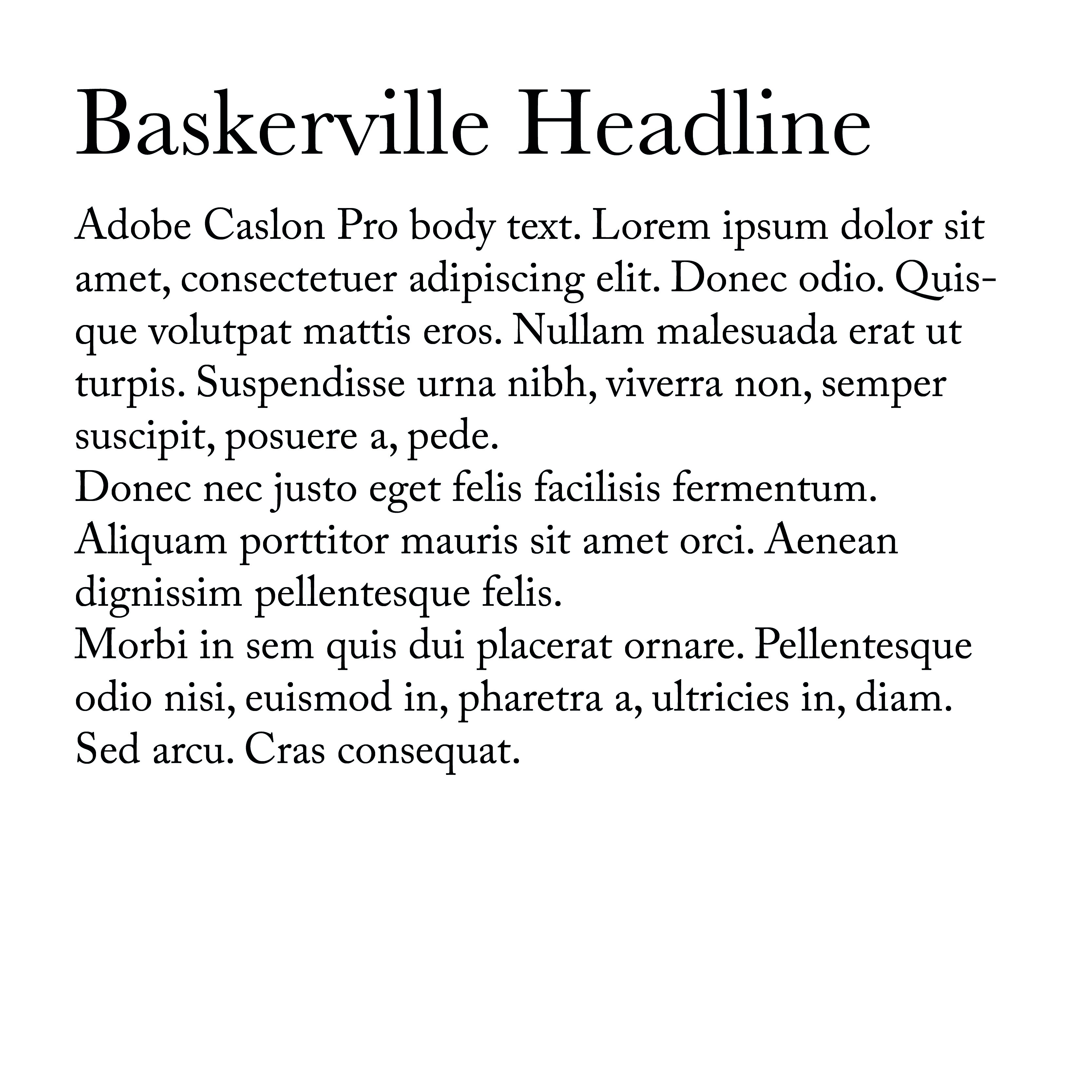
Pairing serifs with sans-serifs to create contrast
You might consider using just one typeface and using scale, colour or weight to indicate heirarchy
If you do choose to pair fonts there are some considerations
Pairing fonts
You want enough contrast to indicate a deliberate difference between typefaces
Pairing two serifs with each other is difficult because the different serif styles tend to clash
Therefore it's common practice to pair serif body text with sans-serif headlines or vice-versa
Establishing hierarchy
The most obvious way to indicate heading and subheading priority is through scale
Simply put, the larger the font the more important it is
But there are other ways to establish hierarchy:
Weight
colour
Style
A note on sizing fonts
You can style fonts with by simply specifying the size in pixels
BUT: You can also size fonts using ems and rems
An Em is a relative sizing method. 1em is set by the browser to 16px.
You can then use this to set other typographic elements relative to an em.
A note on sizing fonts
So we could set our p element to 1.2em then our h1 element to 2em
The advatnage of doing this is that if we ever want to change the size of our p element font the other elements will scale appropriately
This is particularly useful because not all typefaces are the same size. Also we may want to tinker with the text size on different displays
Setting type
Typographic Scale
There are two schools of thought about how to size typographic elements in relation to one another
The first school is to do everything by eye. So for example using 16px as a base double the size for a sub head and double again for a headline size and adjust it until it looks right.
The other school suggests using a typographic scale to provide a mathematical base for the scaling of type.
You can find examples of these at: type-scale.com
Measure and line height
An old rule from print typography is that the measure (line length) should be between 45 and 75 charcters, so adjust your text boxes to accomodate this length. Ideally aim for something in the mid 60s.
The line height is the distance between lines of text. There is no magic number as to what this should be because it depends on the fonts descenders, ascenders and things like the font weight.
Measure and line height
Generally the longer the line length the more line height you need to make it more comfortable for the eye to move between lines of text.
Neglecting measure is super common on websites, but it's easy to fix.
Justification
In products like Adobe InDesign there are a host of options to handle hyphenation which don't exist in css.
Because of this is often best to avoid hyphenating text on the web.
Therefore, unless we have a generous measure a left justified / ragged right setting is usually best.
This avoids rivers in our text.
Responsive design
On a desktop people are usually reading text from about an arm's length away.
On a phone or tablet, however we generally read from a closer position.
Therefore we can reduce the font size a bit to compensate. This has the added advantage of increasing our measure slightly.
The measure will always bit a bit short on a mobile, but again we can compenstate by decreasing the line height a bit.